I build screens
people love using.
Small businesses get offered two bad options: a licence they can't afford, or a template that flattens them into everyone else. I design the brand and the interface around how a business actually works, then build the system underneath it, so it stays theirs to change.
Most businesses run on a pile of paper.I turn it into a system.
Most small businesses end up renting software somebody else designed, where anything flexible costs more than a salary. I build the opposite: shaped around the work they already do, for the buyer and the staff at once.
Case studies

The power cuts. The order still goes out.
- Role
- Sole designer & developer
- Timeline
- 2024 to present · in production, v3.3.0
- Outcome
- Entering a batch of five orders went from 40 minutes to 15.
Blitz had two ways to computerise. Buy an ERP built for a factory somewhere with reliable power and a training budget, or commission one locally at a price a startup should not be paying for software it will spend the first year working around. I looked at both, then went and asked the owners, the sales desk and the dispatch team what their week actually looks like.
My move: treat the infrastructure as the brief, not as the excuse. Power cuts, fibre cuts, a two-day wait for a technician, and a floor where the phone is the only computer most people carry. A packaged system treats all four as somebody else's problem. I designed for them first and let every other decision fall out of that.
The constraints that I denoted after stakeholder analysis, and how each one led to a final system design.
| Itm | Material | Order Qty | Un | S | Description | Cust. Material No. | ItCa | Net Price | Curr. | Plnt | SLoc |
|---|---|---|---|---|---|---|---|---|---|---|---|
| 10 | MAT-000418 | 1,250 | PC | WOVEN PP SACK 25KG | TAN | 1250.00 | UGX | 1000 | 0001 | ||
| 20 | MAT-000902 | 30 | RO | STRETCH FILM 23MIC 1.5KG | TAN | 52000.00 | UGX | 1000 | 0001 | ||
| 30 | |||||||||||
| 40 |
Six faults, none of them cosmetic: what it costs, whose process it carries, and what it assumes about the room it runs in.Show the list
- Priced for a company ten times the size. Per-seat licensing plus an implementation fee on one side, a local studio quoting a bespoke build at similar money on the other. Both ask a startup to pay enterprise prices for a fit it will not get.6
- The process belongs to the vendor. A packaged system carries a business model inside it, and where that model and the company disagree, the company is the one expected to change. The misfit never shows up in a demo. It shows up months later, as staff keeping the real numbers in a notebook.6
- Every field on one screen. Thirty inputs in a grey grid: no grouping, no order, no defaults, and no way to tell which ones matter. Recognition is replaced by recall, so you have to already know what the form wants before you can fill it in.5
- The screen never says what it just did. Press Save and the page reloads into the same grey. Whether the order exists is something you find out by going to look for it, which is exactly how the same order gets entered twice.5
- It assumes a desk, a chair and mains power. Fixed-width layouts drawn for a monitor, and a session that dies with the connection. Where the power goes out this often, that is not an edge case, it is a normal Tuesday.1
- Training is a line item. Nothing here is learnable by using it, so competence has to be installed by a person, in a room, for a week. That cost returns with every hire, and it is never the number on the quote.4
| Operations | ID | Customer | Category | Address | City | Contact | Phone | Currency | Payment Mode | Day Number | Designation | Reference | |
|---|---|---|---|---|---|---|---|---|---|---|---|---|---|
| Edit Delete | 1 | Nile Beverages Ltd | B2B | Plot 14, Industrial Area | Kampala | R. Kiggundu | +256 414 220 118 | UGX | Credit | 30 | Procurement Officer | procurement@nilebeverages.example | REF-0001 |
| Edit Delete | 2 | Savannah Foods Ltd | B2B | Plot 7, Ntinda | Kampala | A. Nabirye | +256 414 331 204 | UGX | Cash | 0 | Supply Chain Lead | supply@savannahfoods.example | REF-0002 |
| Edit Delete | 3 | Kigo Dairy Ltd | B2B | Kigo Road | Entebbe | P. Ssemwanga | +256 392 118 402 | UGX | Credit | 45 | Operations Manager | orders@kigodairy.example | REF-0003 |
Shipping it ugly bought three months of real data, the requirements no interview produced, and a migration instead of a fresh start.Show the list
- I built this, and I did not design it. Bootstrap straight out of the box: default buttons, default modals, default tables. That was the decision, not an oversight. A company with no system at all needed one running in weeks.
- It bought three months of real data. v2.0 shipped a quarter later as a migration, not a move: same customers, same order history, same IDs, nothing re-typed. A system that arrives empty asks a business to do its worst week twice.
- It bought the requirements. Watching people use it told me what no interview did: which fields get skipped, which get filled with a full stop to get past the validation, and that most orders enter the building as a photograph on WhatsApp.
- But everything was a modal. Create a customer, edit a specification, delete a record: the same grey box over the same page every time. No sense of place, no way back, and no answer to the question of where in the system you currently are.5
- Fourteen columns, all at the same volume. The customer table printed every field it had at equal weight. The eye is very good at pulling one thing out of many when a design lets it, and a uniform grid of small grey text does not.7
- And it needed the network to be up. A failed form post lost the typing. That is the single thing this business cannot afford, and it is the reason there was a version two at all.1

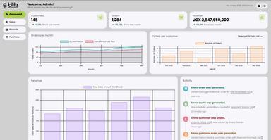
- A new order was generated.Daniel Okello generated an order for Nile Beverages LtdJust now
- A new quote was generated.Grace Nakato generated a quote for Serengeti Snacks Ltd12 minutes ago
- A new customer was added.Victoria Millers Ltd was added by Grace Nakato1 hour ago
- A new purchase order was generated.Daniel Okello raised a purchase order with Rwenzori Polymers Ltd3 hours ago
- A new report was generated.February sales report was exported by Grace NakatoYesterday
| Operations | Order ID | Customer Name | Order Date | Delivery Date | Status |
|---|---|---|---|---|---|
| BETAPrint OrderPrint for Production | BP-1594 | Bunyoro Grain Traders | 18-03-2026 | 20-03-2026 | Created |
| BETAPrint OrderPrint for Production | BP-1593 | Nile Beverages Ltd | 17-03-2026 | 20-03-2026 | Awaiting sync |
| BETAPrint OrderPrint for Production | BP-1592 | Serengeti Snacks Ltd | 16-03-2026 | 23-03-2026 | Production |
| BETAPrint OrderPrint for Production | BP-1591 | Kigo Dairy Ltd | 16-03-2026 | 24-03-2026 | Dispatch ready |
| BETAPrint OrderPrint for Production | BP-1590 | Rwenzori Tea Exports | 13-03-2026 | 25-03-2026 | Completed |
- It runs on the phone in their pocket. One responsive app and one account, with no second mobile product to keep in step. When the power goes, the work moves to a device with its own battery, which is why the layout is designed from the small end up rather than squeezed down to it.1
- A submission survives the network. New entries are held on the device and confirmed on screen straight away, then reconciled when the connection returns. The alternative is a spinner on a dying link, and a spinner is just a slower way of losing the work.2
- Figures before sentences. Three numbers across the top, each with a direction and a comparison to last month. Position, length and colour are registered before a reader has decided to look at anything, so the state of the business arrives ahead of the reading.7
- The screen always says what it just did. Saved, queued, restored, re-scheduled. Every action answers in the place the action happened, so nobody has to go and verify the system by hand.5
- One thing at a time. Order entry is a short form and a line-item table that grows as you add to it, instead of thirty inputs demanded at once. The order is the list you can see, so the form never has to be remembered.5
- The process is theirs. Orders, quotations, records and purchases are named the way the floor names them, in their currency, on their delivery calendar. The software was written around their week rather than around a package's idea of one.6
Slow is a design problem before it is a bandwidth problem.
The connection here is not reliably anything, so the interface stops treating the server as the source of truth about whether your work happened. Press the button and the row appears, marked as queued, and the sync is the software's problem rather than yours. What that buys is not speed, it is the ability to keep going.2
Nobody reads the manual, so the screen has to be it.
New staff learn this system by using it: a short guided pass the first time you open a section, then hints that sit next to the thing they explain rather than in a document nobody opens. People are motivated to get started, not to get trained, and an interface that fights that loses to a notebook.3
Undo is infrastructure.
Two days from technical help, the expensive mistakes are the irreversible ones. So deletes are soft for thirty days, restoring an order brings its line items back with it, and the trash tells you which is which. Confidence is a design output: people who know they cannot break it will actually use it.5
Features
The two the system is actually known for internally, and what each one is for.
The machine reads. The human signs.
The obvious build was a customer portal, and nobody would have used it: it asks every customer to change how they order, for the vendor's convenience. So the work went on my side of the screen instead. An order arrives as a WhatsApp photo, a PDF, a scanned purchase order, or a sheet of paper walked to the desk, and Claude reads all of it into a draft record. Nothing commits on its own.
- Every extracted field shows its source. Quantity, price and delivery date each name the line of the original they came from, so checking the draft is reading two things side by side rather than trusting a number that appeared.8
- Uncertainty is shown, not hidden. A value the model is unsure of is flagged and left for a person. Automation that is quietly wrong is worse than automation that is loudly unsure.8
- A person approves before anything is real. Keeping a human in the loopThe machine proposes and a person approves. Nothing a model produced reaches the record until somebody has read it and signed it off. is the difference between a tool people adopt and one they quietly work around. The time saved is in the typing, and the typing is the part nobody wanted to do.
- It collapsed forty minutes into fifteen. A batch of five orders used to take about forty minutes of transcription. It now takes about fifteen, and the fifteen are spent reading rather than typing.
Software that knows what day it is.
Blitz runs a mixed floor: Eid, Christmas, Diwali and the national days all land in the same delivery calendar. The system knows the dates, so it says so, shifts the dispatch deadlines that fall on them, and greets the people whose festival it is. Pick a day below and it tells you what dispatch can and cannot promise.
| Monday | Tuesday | Wednesday | Thursday | Friday | Saturday | Sunday |
|---|---|---|---|---|---|---|
Thursday 19 March 2026: Dispatch closed for Eid al-Fitr. 14 deliveries moved to Fri 20 Mar.
- BP-1583Kigo Dairy Ltd
- BP-1584Rwenzori Tea Exports
- BP-1585Victoria Millers Ltd
- BP-1586Pearl Cosmetics Ltd
- BP-1587Bunyoro Grain Traders
- BP-1588Savannah Foods Ltd
- The planning stops being somebody's memory. Dispatch used to work out the knock-on effects of a closed day by hand, order by order. The calendar shifts the affected deadlines and shows which ones moved, so the re-plan is a thing you check instead of a thing you do.
- Recognising a festival is not decoration. Belonging and uniqueness are both conditions of an inclusive team, and a shared tool that names one group's festival and not another's is quietly making a statement about who it was built for. This one names all of them.9
- Reported back as a calmer floor. In my own conversations with staff, the two things that came up were people wishing each other well on days the system surfaced, and dispatch no longer carrying the holiday schedule in their heads. Qualitative, from a team of twenty, and reported as exactly that.
Revenue for the month was UGX 2,847,650,000, an increase of 14.7 per cent on the previous month.
a batch of five orders
20 regular users
hosting, domain, email, AI
migrated, not re-typed
SOURCES · 10Show the list
- World Bank Enterprise Surveys (2025). Firms experiencing electrical outages (% of firms), Uganda: 79.9. World Bank Group, Uganda country data. data.worldbank.org ↗
- Nielsen, J. (1993). Response times: The 3 important limits. Nielsen Norman Group. nngroup.com ↗
- Carroll, J. M., & Rosson, M. B. (1987). Paradox of the active user. In J. M. Carroll (Ed.), Interfacing Thought: Cognitive Aspects of Human-Computer Interaction, MIT Press, 80–111. nngroup.com summary ↗
- Sweller, J. (1988). Cognitive load during problem solving: Effects on learning. Cognitive Science, 12(2), 257–285. doi.org ↗
- Nielsen, J. (1994). 10 usability heuristics for user interface design. Nielsen Norman Group, last updated 2024. nngroup.com ↗
- Soh, C., Kien, S. S., & Tay-Yap, J. (2000). Enterprise resource planning: Cultural fits and misfits: Is ERP a universal solution?. Communications of the ACM, 43(4), 47–51. doi.org ↗
- Healey, C. G., & Enns, J. T. (2012). Attention and visual memory in visualization and computer graphics. IEEE Transactions on Visualization and Computer Graphics, 18(7), 1170–1188. doi.org ↗
- Parasuraman, R., & Riley, V. (1997). Humans and automation: Use, misuse, disuse, abuse. Human Factors, 39(2), 230–253. doi.org ↗
- Shore, L. M., Randel, A. E., Chung, B. G., Dean, M. A., Holcombe Ehrhart, K., & Singh, G. (2011). Inclusion and diversity in work groups: A review and model for future research. Journal of Management, 37(4), 1262–1289. doi.org ↗
- Locke, E. A., & Latham, G. P. (2002). Building a practically useful theory of goal setting and task motivation: A 35-year odyssey. American Psychologist, 57(9), 705–717. doi.org ↗
How were the numbers gathered?Read more
- The satisfaction figure is an informal survey I ran myself with the twenty people who use the system regularly, not an independent study, and it should be read as what it is.
- The entry-time range is measured against the prototype it replaced, on the same task with the same staff.
- The running cost is the total of invoices I pay and forward to the company.
- The source is not public. It runs Blitz's commercial operation, so this study argues from decisions and from what I can show.
A factory with no front door.
- Role
- Sole designer & developer
- Timeline
- 2024 to present · live
- Outcome
- Monthly search impressions went from about 100 to roughly 700.
My first job as their designer was to stop treating the website as decoration. Blitz makes packaging for companies across Uganda, and what a buyer met was four hand-maintained pages that never named the thing they were searching for. I wasn’t hired to restyle it; I asked to rebuild how it was organised, and then made the case for it.
- Four pages, a dozen product lines. Carrier bags, bread bags, shrink wrap and the rest all shared a single Our Products strip. Nothing a buyer searched for had a page of its own to land on.
- It never used the words buyers type. Someone looking for carrier bags in Kampala found nothing here to match. The site answered to the company name, which is the one search nobody runs.
- The homepage opened on a carousel. No headline, no claim, nothing naming what the company actually made. The first words on the page were Who we are, then three paragraphs of company description before the first product appeared.
- No accessibility baseline. No visible focus states, no considered heading order, no alt text discipline. None of it had been measured against WCAGWeb Content Accessibility Guidelines: the standard for whether a site can actually be used with a keyboard, a screen reader, or low vision..

- Twelve pages, one per thing they sell. Carrier bags, bread bags, shrink wrap and the rest each got a page of their own, named for the thing itself and ending in a way to ask what it costs. A buyer following a search lands on the answer instead of a homepage that happens to mention it.1
- A headline where the carousel was. Visual appeal is judged in roughly 50 milliseconds, before anyone reads a word, and auto-advancing panels get mistaken for adverts and skipped. So the hero holds still and carries one sentence, with three capabilities under it in six words each. People get through somewhere between a fifth and a quarter of the words on a page, and anything longer is a page you choose to open.234
- Pages with nothing to wait for. Shared components render flat pages with no database in the request path. Google's study with Deloitte measured a 0.1 second gain in mobile load time moving retail conversions by 8.4 percent, and the cheapest way to buy that time is never to spend it.5
- Accessibility built in, not retrofitted. Focus states, heading order and alt text live in the components rather than in an audit at the end. The W3C's case is that this widens reach and lowers legal exposure at once.6
Nobody searches your company name.
Buyers type “carrier bags Uganda”, not “Blitz Packaging”. So the site stopped being a brochure and became twelve pages, one for each thing they make. Each one answers the silent question a buyer arrives with: can these people actually do it?
Google reads the page before any buyer does.
Every page has two readers: the crawler that decides who finds it, and the person who arrives. Write for one and you lose the other, because words chosen to rank read like a list. So I stacked them. The line above the headline is the search phrase itself, “flexible plastic packaging solutions in Uganda”. The headline under it is for the human who just landed.
Designed for how buyers actually make contact.
A floating WhatsApp button, because that is the channel Kampala buyers actually use, not a form built for how I'd like them to behave. People arrive carrying the habits every other app taught them, and a site that argues with those habits loses. The publishing workflow means the marketing team runs the site alone: news, campaigns, Google Ads. I don’t want to be a dependency.7
100 → roughly 700
from almost none
(Google Search Console)
SOURCES · 7Show the list
- Pirolli, P., & Card, S. (1999). Information foraging. Psychological Review, 106(4), 643–675. doi.org ↗
- Lindgaard, G., Fernandes, G., Dudek, C., & Brown, J. (2006). Attention web designers: You have 50 milliseconds to make a good first impression!. Behaviour & Information Technology, 25(2), 115–126. tandfonline.com ↗
- Nielsen, J. (2013). Auto-forwarding carousels and accordions annoy users and reduce visibility. Nielsen Norman Group. nngroup.com ↗
- Nielsen, J. (2008). How little do users read?. Nielsen Norman Group, reporting Weinreich et al., ACM Transactions on the Web, 2(1). nngroup.com ↗
- Deloitte, commissioned by Google (2020). Milliseconds make millions. Deloitte Ireland. web.dev ↗
- W3C Web Accessibility Initiative (2018). The business case for digital accessibility. World Wide Web Consortium. w3.org ↗
- Nielsen, J. (2000). Jakob's law of internet user experience. Nielsen Norman Group. nngroup.com ↗
World-class research, filed like an org chart.
- Role
- Self-initiated, no client
- Timeline
- 2026
- Outcome
- A concept, so there is nothing to measure. The artifact is the argument.
The institute's value is that its work crosses departments. Its site is an administrative directory, so that is the one thing you cannot see: research surfaces as news posts and PDFs, ages off the homepage in a fortnight, then stops existing.
My move: make the research problem the primary organising unit. Not the department, not the membership category. People, labs, publications and news all hang off a problem. A directory answers "who is a member?" Members arrive asking "who else is working on this?"
A department is an answer to a question nobody asked.
I sorted the site's published work the way a member would: by what they came to do. Almost nothing sorted cleanly under a department, and everything sorted under a problem. This is desk research rather than a card sortA research method: people group the site's content into piles that make sense to them, so the structure comes from how readers think rather than from how the organisation is arranged. with participants, because it is the sort I could run alone, from what the institute has already made public. Running it properly with members is day one of the engagement, and it would test this rather than replace it.
One structural change does all the work.
Today research is a leaf node in the IAInformation architecture: how a site's content is grouped, ordered and named. It decides what a reader can find, and it is invisible until it is wrong.: buried under news, or a PDF attached to a member's page. Move it to the root and the cross-departmental collaboration the institute exists for becomes the thing you browse, not the thing you have to already know about.
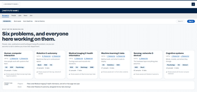
The institute supports research clusters in areas of established and emerging strength. We provide various combinations of seed funding, lab and office space, workshop and conference logistical and financial support, and grant-writing and communications support to the following clusters:
Lead: A. Researcher, ECE. This cluster focuses on how people work with systems that learn, including interfaces for machine learning models, the design of explanations, and the study of trust and reliance in automated decision support across a range of applied settings.
Leads: B. Researcher, Mech; C. Researcher, CS. The cluster endeavours to advance how machines act in unstructured space. By collaborating with experts in engineering, biology and public policy, it addresses key challenges such as manipulation under uncertainty, safe motion planning, and field deployment in remote environments, and it leverages advanced computational techniques and machine learning to promote resilient autonomous systems and enhance robotic communication.
Leads: D. Researcher, Radiology; E. Researcher, BME. Turning scans, signals and records into decisions clinicians can act on.
Lead: F. Researcher, CS (Director); G. Researcher, CS (Founding Director). The centre is the university's centre of excellence for method work and knowledge mobilisation, with a network of more than fifty professors leading groups that develop tools for decision-making and action. The centre also studies the social, policy and ethical impacts of the field.
Lead: H. Researcher, ECE. The hardware layer everything else assumes.
Leads: I. Researcher, Psychology; J. Researcher, CS. This cluster brings together work on minds, models and where they diverge, spanning perception, memory and language, and connecting experimental work with computational accounts of the same phenomena.
- Every cluster is a paragraph. Name, lead, then prose. No counts, no tags, no dates: nothing is broken out, so the only way to compare two clusters is to read both and hold them in your head.
- One runs eight lines, the next runs two. Length tracks who wrote the entry, not how much work sits behind it, and on a page with no other signals length is the only signal.
- Some clusters lead off the site entirely. A few names are links to a separately built cluster website with its own navigation and its own look. Others go nowhere at all. Either way the institute stops being the place its research lives.
- The overlap is in the prose, never in the structure. Individual entries mention working with clinicians, or with marine biology and public policy. That cross-faculty collaboration is the institute's stated purpose, and the page can only tell you about it one paragraph at a time.1
- A card that answers before you read it. Name, one line of what it is, then people and labs as figures, in the same shape every time so a short entry no longer reads as a minor one. You can rank six of these without finishing a sentence.23
- Departments as tags, not as prose. The faculties involved sit on the card as badges. Two clusters sharing a tag is the collaboration the institute exists for, finally visible in the structure instead of buried in the fourth sentence of a paragraph.1
- Overlap is a first-class field. Each cluster names the others it shares people with. That is the question a member actually arrives with, and no amount of prose per cluster can answer it: the answer lives between clusters.4
- Every cluster stays on the institute. A cluster page is a page here, with its people, labs, publications and facilities attached, and outside project sites become one link among those.
Features
What the rework adds, and what each one is for.
News that does not stop existing after a fortnight.
A good feed needs two things: to be easy to keep current, and to be worth looking at. One decision does both. Every item is filed against a research problem before it publishes, so publishing once puts it in the feed and on the problem page, and that same tag becomes the lead item's artwork: the subject set large rather than a photograph of a corridor.
- One required field does all of it. An item is filed against a research problem before it can publish, and that single tag puts it in three places at once: the feed, where it is current; the problem page, where it stays; and the calendar, if it carries a date. The CMSContent management system: the interface a team publishes through, so changing the site means filling in a form rather than editing code or waiting on a developer. gains one field and the site stops losing its own history.
- The feed is a view, not the archive. Nothing here exists only in the feed. A post from four years ago still sits on the problem page it belongs to, because that page is organised by subject rather than by date. News ageing off the homepage stops being the same event as news disappearing.1
- The one visual element is generated from the record. The problem an item is filed under is already captured, and setting it large is what makes the lead read as a lead. Visually engaging and easy to update stop being two requirements if the art comes out of a field the editor has already filled in.2
Filter by what it is. Register without leaving.
Speaking engagements, workshops, socials and deadlines, narrowed by type and registered for in the same row you read them in. The filters work, the days select, arrow keys move through the month and the register buttons hold their state. A calendar you cannot operate is a picture of a calendar.
Showing 14 of 14 events in March 2026 · all types
| Sunday | Monday | Tuesday | Wednesday | Thursday | Friday | Saturday |
|---|---|---|---|---|---|---|
- The filter announces itself to a screen reader. Narrowing to two types updates a count in a live regionA part of a page marked so a screen reader announces it when it changes. Without one, an update that is only visible is simply missed., so someone who cannot see the grid redraw still learns what changed. A day whose events are hidden says how many rather than quietly looking empty.5
- Registration sits where the decision gets made. Seats remaining are in the same row as the event, and so is the button. No second page, no third-party form, and no finding out it was full after you had already decided to go.6
- The whole month works from the keyboard. Tab reaches the grid once, then the arrow keys walk the month and the panel below follows the day you land on. Focus is visible on every control, the month is a real table caption so a screen reader announces which one it is reading, and the register button reports its own state instead of only changing colour. This is the part that normally waits for an audit to find it.57
SOURCES · 8Show the list
- Institute for Computing, Information and Cognitive Systems (2026). A multidisciplinary research institute supporting collaborative research, with over 150 faculty from 10 faculties and schools. University of British Columbia. icics.ubc.ca ↗
- Nielsen, J. (2008). How little do users read?. Nielsen Norman Group, reporting Weinreich et al., ACM Transactions on the Web, 2(1). nngroup.com ↗
- Nielsen Norman Group (2017). F-shaped pattern of reading on the web: Misunderstood, but still relevant (even on mobile). Nielsen Norman Group. nngroup.com ↗
- Pirolli, P., & Card, S. (1999). Information foraging. Psychological Review, 106(4), 643–675. doi.org ↗
- W3C (2018). Web Content Accessibility Guidelines (WCAG) 2.1. W3C Recommendation. w3.org ↗
- Nielsen, J. (2000). Jakob's law of internet user experience. Nielsen Norman Group. nngroup.com ↗
- W3C Web Accessibility Initiative (2018). The business case for digital accessibility. World Wide Web Consortium. w3.org ↗
- Sweller, J. (1988). Cognitive load during problem solving: Effects on learning. Cognitive Science, 12(2), 257–285. doi.org ↗
Disclaimer: this is a self-initiated concept with no affiliation with the University of British Columbia or ICICS.Read more
I found a clusters page I thought could be considerably better, took it as a base and made the case. I have no inside knowledge of their constraints. Every render above is my own build in HTML and CSS, and it uses the University of British Columbia's published brand colours, because the before and the after have to share a palette or the comparison is just colour. No crest, wordmark or logo appears anywhere: those are theirs, and the argument is about structure.
The five screens are populated with illustrative content: names, counts and dates that show how the layout behaves, not findings about the institute. The content audit above is the one artifact making a claim, and it is sorted from published material.
Also shipped
Employee & HR portal
Records, time-off and clock-in hours managed by HR themselves, and it replaced a paid third-party licence.
Vehicle control software
On the vehicle controls team: the software that reads the sensors and drives the motors on a Formula Student race car, integrated with suspension and electrical.
Written up on the embedded site →HelloDay, classroom platform
Two-person build. I took the client's brand guidelines into web and mobile screens, then owned auth and load: 5,000 concurrent users, COPPA safeguards for under-13s, a security audit acted on before launch.
I'd rather fix the form than redraw the logo.
I'm a computer engineering student at UBC, graduating 2029. For the last two years I've been the only designer at a manufacturing company in Uganda: researcher, illustrator, full-stack dev, and the person who trains the marketing team on Monday morning.
That mix is the whole point. I design as the customer first (I want to know why someone bounced before I want to know what typeface we're using) and then as the stakeholder who has to live with the maintenance bill. What I care about most is giving a business room to be itself: real customisation, on architecture that won't trap them in two years.
University of British Columbia
Vancouver · 2029
DELF B1 & B2